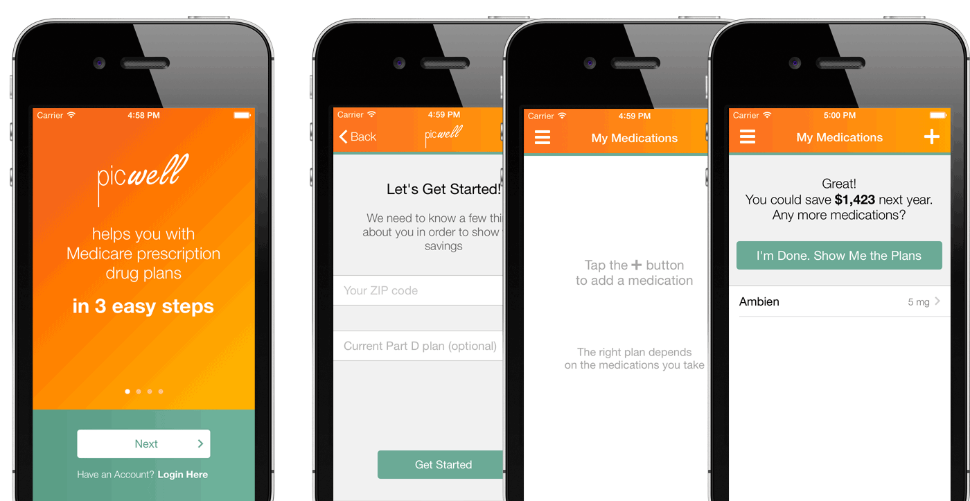
Picwell

I helped the Picwell team define the user flow of their app for seniors to choose personalized Medicare Part D plans.

My Role

UX Designer

Client

Picwell

Timeline

2 weeks

Tools Used

Adobe XD, Apple Keynote, ProtoPie

The Challenge

The target user group

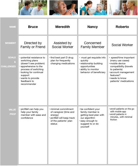
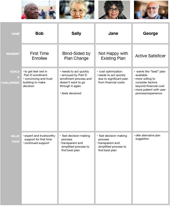
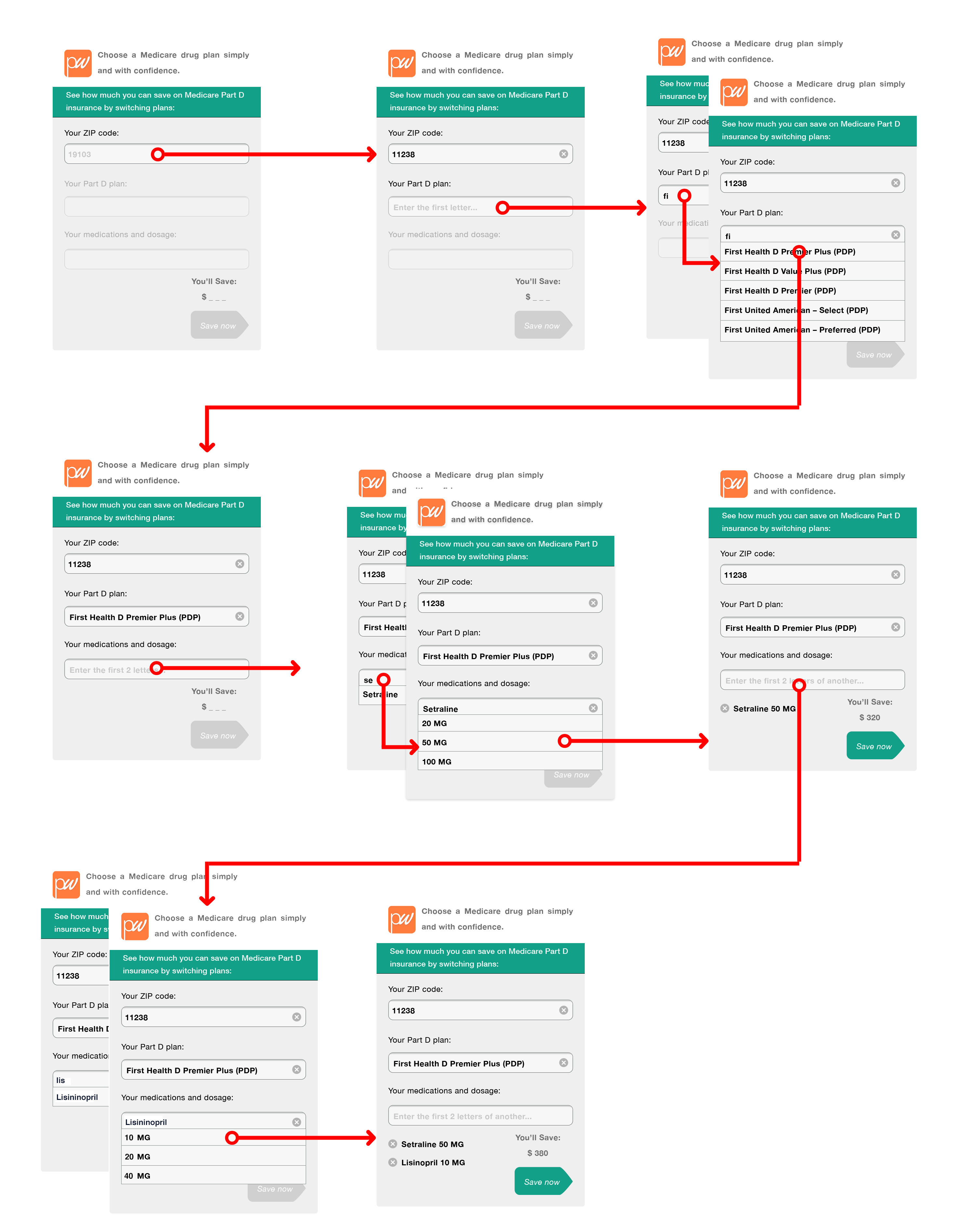
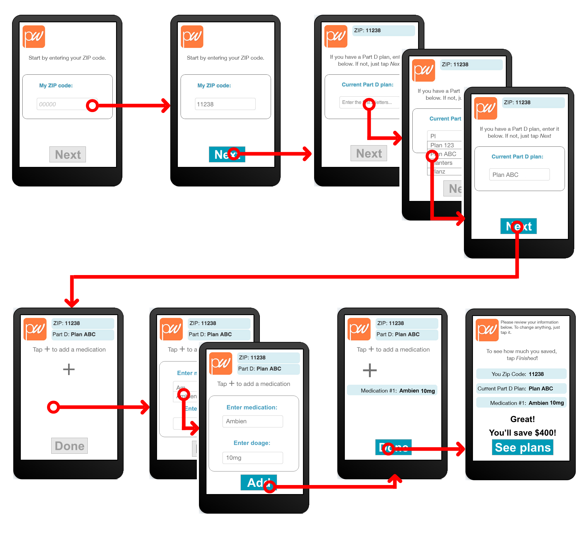
Picwell's targeted users were people on Medicare who are 65+. Beyond the prevelnce of vision difficulties, our users cognitive abilities and what their everyday interactions may come into play.

Their mental models differ greatly than what us youngins are used to and expect to see and experience when using an app.

How might we...

  • take a process wrought with complexity and boil it down to less than a dozen screens?
  • enable senior citezens with potentil vision, dexterity, or cognitive difficulties navigate their selection making?
  • avoid falling victim to a mental model mismatch by relying on modern patterns that aren't understood?

Defining our user segments

I helped the team put together proto-personas to keep all these users and their motivations in mind when developing the marketing plan and the user experience.

Space
Space

Testing a user flow

An information architecture diagram was translated to a user flow, and printed and used for some quick user testing:


Iterating and testing again

We learned that that referencing the inactive but upcoming steps in the process confused the users that we tested with.


This paved the way for the next low-fidelity prototype for testing:

This time, the users zoomed right through it. With a user-flow established, I handed off the files to the UI design team:

Landing page web design

WWhen the app was ready for action, the Picwell team asked if I could whip up a landing page to announce the release of the app and get folks signed up in partnership with Penn Medicine.

Picwell went on and pivotted to solve the empoloyee benefits puzzle and was acquired by Jellyvision

OVCP case study

Time is Muscle project