David Pindrys
Download Resume

Turning fragmented patient records into coherent clinical narratives

VEHR Technologies, patient timeline interface on iPad
RoleFounding Product Design Lead
ClientVEHR Technologies
Timeline4 months
StatusIn development
SUMMARY

I worked with a practicing physician to design a chart review workflow that makes dense patient data over time easier to interpret, and delivered scalable components now being implemented by his development team.

TEAM

Founding clinical lead, engineering team, and myself

"As a first-time founder, David's guidance was crucial. His work greatly advanced our team's quality and timeline."
Cole Marolf MD
Cole Marolf MDPracticing clinician & Founder, VEHR Technologies

Mapping Chart Review

Deconstructing the Chart Review Process

I worked with Cole to map the objects clinicians use during chart review — encounters, notes, diagnoses, labs, vitals, and medications — then used those relationships to shape the VEHR timeline.

Chart review mapping: clinical objects and relationships

Cole's paper chart system: A useful reference for how clinical information gets organized when the record structure follows the clinician's reasoning.

Domain map of problems, events, and relationships for chart review

Object mapping: Translating that reasoning into encounters, diagnoses, labs, vitals, medications, and notes.

The Core Problem

Fragmented patient records disrupt clinical reasoning

Clinicians rarely review one data type at a time. They reconstruct what happened to a patient across encounters, labs, medications, diagnoses, and patient-reported information—often by moving between tabs, comparing dates, and mentally stitching context back together. The record is organized by source; clinical reasoning runs along time.

Patient stories are split across sources

The same systemic issue shows up differently depending on which part of the chart a clinician is reviewing. Encounters, notes, diagnoses, and orders live in separate modules—clinicians compare dates across tabs to rebuild chronology and lose surrounding context when any one view is opened in isolation.

Encounter list: Events are chronological, but the longitudinal story still has to be assembled manually.

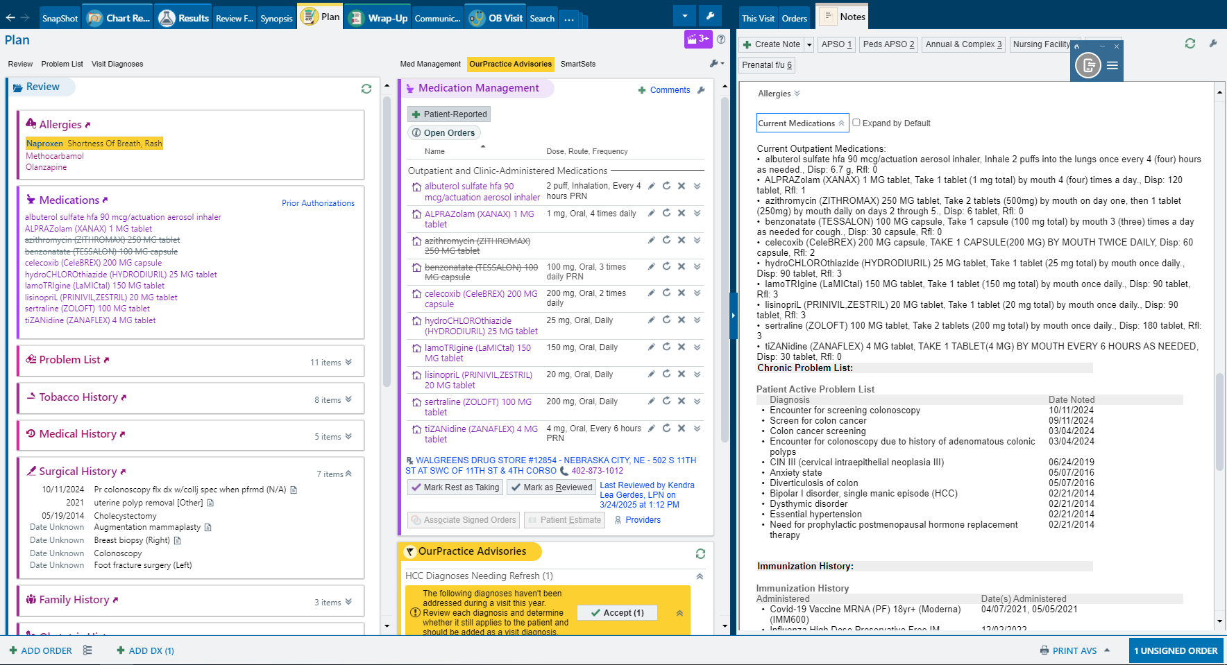
Visit report: Diagnoses and orders are visible, but disconnected from labs, medications, and symptoms at adjacent visits.

Trends become noise quickly

Labs and vitals are most useful longitudinally, but tabular review buries change in rows while multi-scale trend lines compete for attention. Interpreting whether a value matters—and what surrounded it—becomes its own reconstruction task.

Tabular review: Values are available, but abnormality and change have to be found row by row—without visit context.

Spaghetti trends: Overlapping lines and competing scales obscure the changes that matter at a specific point in care.

Medication lists hide the story of change

Medication lists show what a patient may be taking now—not when therapy started, stopped, or escalated, or how those decisions related to outcomes and encounters. Treatment progression has to be rebuilt from notes and orders.

Epic EHR medication list where change history is not visible at a glance

The Core Solution

On Timeline. One Story.

VEHR aligns key clinical and patient-reported data on the same visit columns. This shared temporal model makes it easy to understand what changed, when it changed, and what else was happening around it.

Mild fatigue, thirst, sleep disruption

Severe fatigue, thirst, dizziness, blurry vision

Symptoms improving, still present

Energy and sleep improving

T2 Diabetes

Stable

T2 Diabetes

Exacerbated (acute hyperglycemia)

T2 Diabetes

Managed

T2 Diabetes

Improving

UC

Urgent Care Visit

ER

Emergency Department Visit

PCP

Primary Care Follow-up

Tele

Telehealth Follow-up

Glucose 186 mg/dL

BP 138/88 mmHg

Glucose 342 mg/dL

BP 168/102 mmHg

Glucose 248 mg/dL

BP 152/94 mmHg

Glucose 154 mg/dL

BP 136/84 mmHg

Metformin

500 mg BID

Insulin glargine

Not prescribed

Metformin

500 mg BID

Insulin glargine

10 units nightly

Initiated in ED

Metformin

1000 mg BID

Insulin glargine

12 units nightly

Dose increased

Metformin

1000 mg BID

Insulin glargine

12 units nightly

Continued

Jul 21

Urgent Care

Sep 09

Emergency Dept

Sep 10

PCP Follow-up

Sep 14

Telehealth

The clinical story across domains

Symptoms on the Timeline

Fatigue, thirst, and insomnia align to the same visit columns as encounters, labs, and medications. Burden intensifies into Sep 09 and eases across PCP and telehealth—so patient-reported change reads with the clinical events around it.

1. Symptom burden over time

Shared temporal alignment reveals how symptoms intensified leading into the emergency visit on Sep 09 and gradually improved after treatment changes at Sep 10 and Sep 14.

4
8
6
3
3
9
5
2
5
8
6
3
Jul 21
Sep 09
Sep 10
Sep 14
FatigueThirstInsomnia

2. Detail at the acute visit

A concise panel anchors severity and context to Sep 09 without pulling clinicians out of the longitudinal read.

4
8
6
3
3
ThirstSep 09
9/10

Persistent excessive thirst and nocturia reported during ED intake.

Trend: Significant worsening from prior visit

9
5
2
5
8
6
3
Jul 21
Sep 09
Sep 10
Sep 14
FatigueThirstInsomnia

Diagnoses in Context

Encounters and diagnoses share the same visit columns. For this patient, poorly controlled Type 2 diabetes escalates into acute hyperglycemia at the ED on Sep 09, then moves toward managed and improving states at PCP and telehealth follow-up—without leaving the timeline.

1. When did care happen?

Jul 21, Sep 09, Sep 10, and Sep 14 share one axis—urgent care, emergency department, PCP follow-up, and telehealth—so every domain below references the same visits.

2. How did the diagnosis evolve?

T2 diabetes moves from stable at urgent care to exacerbated at the ED on Sep 09, then managed at PCP and improving by telehealth—not a static problem list entry.

3. What happened at the ED?

Sep 09 ties hyperglycemia, presenting symptoms, and treatment escalation to the emergency visit—without leaving the shared columns.

Physiologic Changes

Glucose and blood pressure read as longitudinal patterns on the same dates as symptoms and medications: early elevation at urgent care, a marked spike at the ED on Sep 09, then gradual improvement through PCP and telehealth. Color carries severity; exact values and context stay one interaction away.

1. Pattern over time?

Glucose and blood pressure read as longitudinal patterns—early elevation, acute worsening at the ED visit, then gradual stabilization after treatment changes.

Jul 21Sep 09Sep 10Sep 14
GlucoseBP

2. What's the value?

Exact glucose and blood pressure values sit on the same dates as symptoms, encounters, and medications—so the acute spike on Sep 09 is never read in isolation.

Jul 21Sep 09Sep 10Sep 14
GlucoseBP

3. What explains it?

Opening the Sep 09 glucose cell shows why the value mattered: marked hyperglycemia in the context of the emergency visit and treatment escalation that followed.

Jul 21Sep 09Sep 10Sep 14
GlucoseBP

Understanding Treatment Changes

Inspired in part by Jeff Belden, MD’s medication-list usability work, VEHR treats medications as events on the shared timeline—not static list items. On Sep 09, metformin proves insufficient and insulin begins; by Sep 14, dosing and glycemic control align with the same columns used for labs and encounters.

1. Treatment progression over time

Metformin continues through the timeline; insulin glargine appears when oral therapy alone was no longer enough—aligned to the same dates as labs and encounters.

2. Dose changes in context

Dose labels on the bar show metformin titration from 500 mg BID to 1000 mg BID after the acute event—read beside glucose and visit type on the same columns.

3. Why insulin started

Sep 09 documents initiation during the ED visit—dose, reason, and status without leaving the longitudinal view.

The Full Prototype

Putting the Timeline Together

The final prototype combines encounters, diagnoses, labs, vitals, medications, patient-reported context, and compressed time into one interactive timeline. Clinicians can start with the patient story, scan for clinical signals, then drill into source details only when needed.

“David demonstrated strong insight into reframing healthcare data interaction… especially the heat map, which improved data density while maintaining clarity.”
Dr. Cole MarolfDr. Cole Marolf